Shopify Collection Page Optimization: The CRO Checklist
Your collection page decides whether shoppers ever reach your product pages — and it quietly drives 30–40% of your organic traffic. Most stores leave it on default sort with no copy. Here's the full CRO checklist for Shopify collection pages, in priority order, plus the honest part: the checklist is a hypothesis, and faceted navigation is an SEO trap.
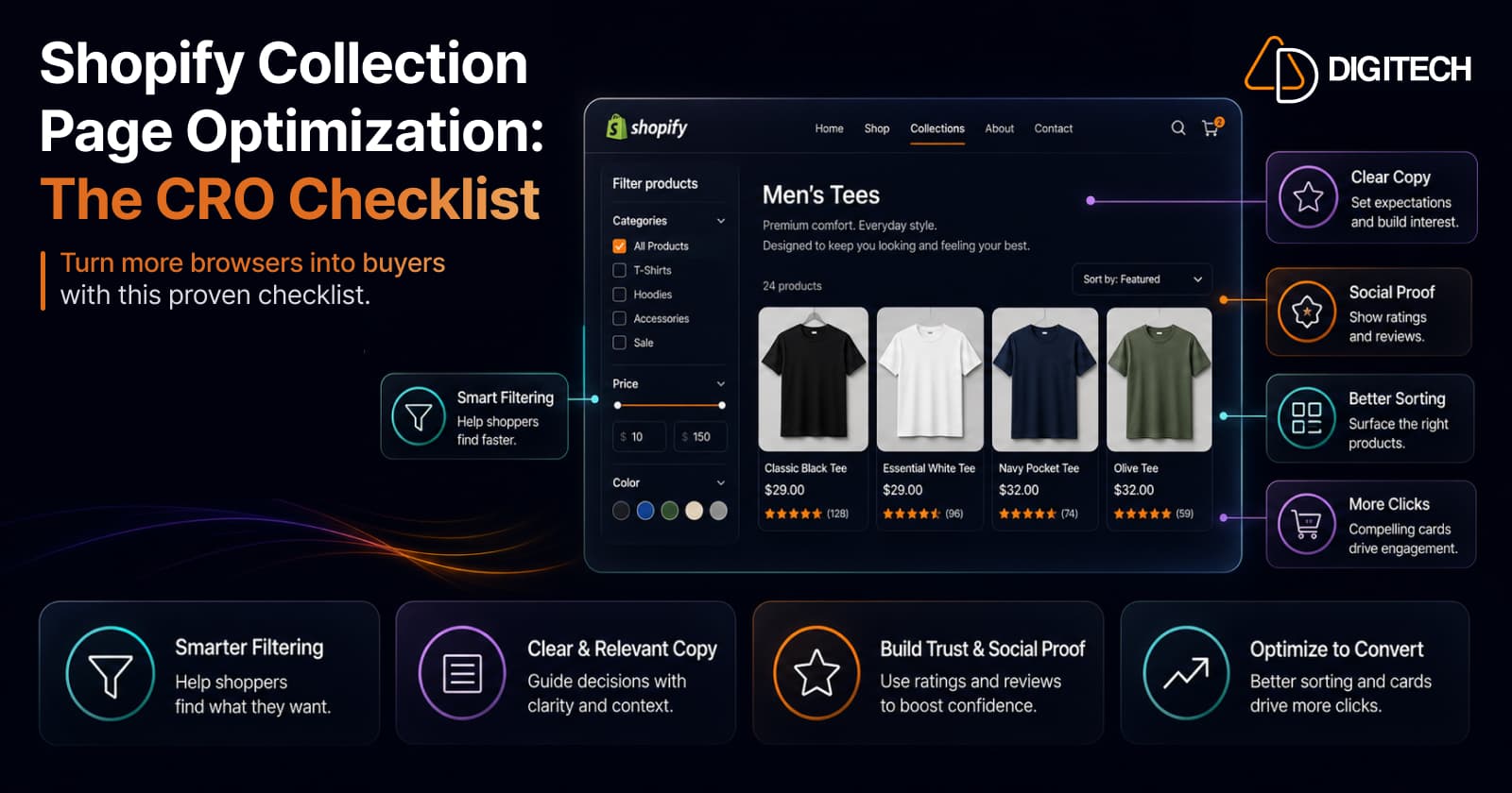
The short version: your collection page is the browsing layer — it decides whether a shopper ever reaches your product pages, and it quietly drives 30–40% of your organic traffic. Most stores leave it on default sort with no copy and call it done. Here's the checklist to fix that, in priority order — plus the honest part: it's a hypothesis to test, and faceted navigation is a genuine SEO trap.
We build and optimise Shopify collection pages, so this is the checklist we actually run — and the traps we steer around.
Your collection page has two jobs — and most stores optimise neither
A product page has one job: convert a shopper who's already interested. A collection page has two:
- Browsing (CRO). It's the bridge between landing and buying. If a shopper can't quickly find something worth clicking, all the work you've put into your product pages never gets seen. A weak collection page is one of the quietest reasons stores lose sales despite growing traffic.
- SEO (organic traffic). Collection pages are estimated to drive 30–40% of Shopify organic traffic — they rank for the category-level searches ("women's running shoes") that product pages can't. Yet most stores ship them with zero unique copy and Shopify's default sort order.
Optimising one job and ignoring the other leaves money on the table both ways. The checklist below covers both.
Two ground rules before the checklist
1. Speed is the floor. A collection page is a wall of images — the single easiest page in your store to make slow. If it's sluggish on mobile, fix that first; improving Core Web Vitals without ripping out your theme is the prerequisite, not an afterthought. (Pages loading under 3 seconds have been found to retain around 32% more users.)
2. A checklist is a hypothesis, not proof. Everything here is usually right, which makes it a sensible default — but "usually right" isn't "right for your catalogue, your price point, your shoppers." Ship the hygiene, then test the specifics on your own traffic.
1. Filters and sorting — the highest-leverage area
This is where the biggest, fastest wins live. Shoppers who use filters view around 3x more products and convert at higher rates, and investing in filter UX has produced conversion lifts of roughly 4–6% on the affected category pages.
- Offer the filters that matter for your catalogue — size, colour, price, availability, and popularity are the workhorses. Match them to how people actually shop your products.
- Make filters fast and mobile-friendly. A filter drawer that's clumsy on a phone gets abandoned.
- Set a smart default sort. Best-sellers first, out-of-stock last. Shopify's default order is rarely your best order, and leaving it untouched is the most common missed win on the whole page.
2. Product cards that earn the click
Each product card is a mini product page — the shopper decides whether to click based entirely on it. Make every card carry its weight:
- A clean, consistent primary image across the grid — inconsistent crops and backgrounds make a collection feel cheap.
- Clear price (and a visible sale price where it applies).
- Star rating and review count on the card — social proof works at the browsing stage too, not just on the product page.
- A small, honest badge where relevant — "Best seller," "New," "Low stock" (only if true).
- Optional quick-add / quick-view to shorten the path for decisive shoppers.
3. Merchandising — never ship on default sort
Filtering is what the shopper controls; merchandising is what you control, and it's just as important. The order products appear in is a marketing decision, not a technical default:
- Lead with your heroes — best-sellers and high-margin products at the top, where attention is highest.
- Push out-of-stock to the bottom (or hide it) so shoppers don't hit dead ends.
- Curate seasonally — a collection that reorders itself for the season converts better than a static one.
This is also where the platform is evolving in your favour — it's worth knowing how Shopify collections are changing so you're merchandising with the current tools, not the old ones.
4. Layout and the mobile grid
Most of your collection traffic is on a phone, so the mobile grid is the page:
- Use a 2-column grid on mobile — it shows more products per screen than a single column without shrinking them into illegibility.
- Lazy-load images below the fold, but get the first row visible fast.
- Don't bury the products. A giant hero banner that pushes the first product below the fold is a conversion killer — a slim banner or none at all beats a full-screen image the shopper has to scroll past.
5. Pagination and the SEO traps
This is the part that separates a page that ranks from one that doesn't:
- Show ~24–48 products per page. Enough to browse, few enough to stay fast.
- Avoid pure infinite scroll. Googlebot typically loads one screen and stops — products further down effectively don't exist to search unless there's a paginated fallback it can crawl. Infinite scroll is fine for UX if a crawlable paginated version sits underneath; on its own it's an SEO trap that's been catching stores for over a decade.
- Get canonicals right. Each paginated page should carry a self-referencing canonical — don't point every page back to page 1, which tells Google the products on pages 2+ don't exist.
6. Collection copy that does double duty
The single most neglected asset on Shopify. Adding unique 200–400 word descriptions to collection pages has been associated with 20–35% organic traffic increases — because it gives the page something to actually rank for.
- Write it for humans first, keyword second — a natural paragraph that helps a shopper understand the category, not stuffed filler.
- Make each collection unique. Duplicated boilerplate across collections helps nobody and can hurt.
- Place it so it doesn't shove products down — below the grid, or in a collapsed "read more" block up top. The copy is for the crawler and the curious; the products are for everyone.
7. Don't let filters wreck your crawl budget
One more SEO trap, because it's expensive and invisible until it isn't. If every filter click creates a new indexable URL (/collection?color=blue&size=m&sort=price), you can spawn thousands of thin, near-duplicate pages that burn crawl budget and dilute ranking signals.
The cleanest approach for most facets: filter via JavaScript without changing the URL, so shoppers get the full experience but search engines never see the combinatorial explosion. Index only the handful of filtered views genuinely worth ranking (say, a popular colour or brand), each with a deliberate canonical. Everything else stays out of the index by design.
The honest part: where the checklist stops
The same caveats that apply to any CRO checklist apply here.
Genuine urgency only. "Low stock" and "selling fast" work — when they're true. Fabricated scarcity on a collection grid is the fastest way to teach shoppers not to trust your badges. Never fake it.
Relevance beats the rulebook. A 12-product collection doesn't need heavy filtering; a 500-product one lives or dies by it. A fashion grid leans on imagery; a components catalogue leans on specs and filters. Apply judgement, not just the list.
Then test and measure. Treat every item above as a hypothesis and validate it on your traffic — the filter set, the default sort, the copy placement, the grid density. The checklist gets you to competent; the testing is what pulls you ahead.
The quick checklist
Copy-ready, in priority order:
- Speed — fast mobile load before anything else
- Filters — the facets that matter, fast and mobile-friendly
- Sort — smart default (best-sellers first, out-of-stock last), never Shopify's default
- Cards — consistent image, clear price, rating, honest badge, optional quick-add
- Merchandising — heroes first, out-of-stock last, seasonal curation
- Grid — 2-column mobile, products above the fold, lazy-loaded images
- Pagination — 24–48/page, paginated fallback under any infinite scroll, self-referencing canonicals
- Copy — unique 200–400 words per collection, placed below the grid
- Faceted nav — filter via JS without new URLs; index only the few filtered views worth ranking
- Test — every item is a hypothesis; validate on your traffic
The bottom line
The collection page is the most under-optimised high-value page in most Shopify stores — it carries a third of your organic traffic and gates access to every product page you've worked on, yet it usually ships on autopilot: default sort, no copy, no filter strategy.
Get browsing right (filters, sort, cards, merchandising) and get SEO right (copy, pagination, faceted nav) — the collection page is the only page that has to do both.
Fix it, and the rest of your funnel finally gets the traffic it deserves. We help Shopify brands optimise collection and product pages that actually convert — filter and merchandising strategy, the SEO plumbing, and the testing that proves the lift. See our Shopify store development work, or talk to us about your collection pages.
Frequently asked questions
What is a Shopify collection page and why does it matter for conversion?
It's the browsing/category page that lists a group of products — the bridge between a shopper landing and reaching an individual product page. It matters for two reasons: it decides whether shoppers ever get to your product pages at all, and collection pages are estimated to drive 30–40% of Shopify organic traffic, making them a major SEO asset most stores neglect by leaving them on default sort with no copy.
What's the highest-impact change on a collection page?
Filtering and sorting. Shoppers who use filters view around 3x more products and convert at higher rates, and investment in filter UX has produced conversion lifts of roughly 4–6% on the affected category pages. Pair good filters (size, colour, price, availability) with a smart default sort — best-sellers first, out-of-stock last — rather than Shopify's default order.
How many products should I show per collection page?
Roughly 24–48 per page is the sweet spot for both performance and crawlability. Fewer forces excessive pagination; many more slows the page down under the weight of images. Use true pagination (or a 'load more' button with a paginated fallback) rather than pure infinite scroll, so search engines can still reach the products lower down.
Is infinite scroll bad for SEO?
It can be. Googlebot typically loads one screen and stops, so products below the fold may not be seen by search if there's no paginated equivalent to crawl. Google's long-standing guidance is to provide a paginated fallback. Infinite scroll is fine for UX as long as a crawlable paginated version exists underneath it.
Should I add text descriptions to my collection pages?
Yes — it's one of the highest-return SEO moves available. Adding unique 200–400 word descriptions to collection pages has been associated with 20–35% organic traffic increases. Write it for humans, make each collection's copy genuinely unique, and place it so it doesn't push products down the page — below the grid, or in a collapsed block.
Do collection-page filters hurt SEO?
They can, if every filter combination creates a new crawlable URL — that spawns near-infinite duplicate pages and burns crawl budget. The cleanest fix for most facets is to filter via JavaScript without changing the URL, so shoppers get the experience but search engines don't get thousands of thin filtered URLs. Index only the few filtered views genuinely worth ranking, each with a correct canonical.
Building something on Shopify?
We design, build, and maintain Shopify apps, stores, and AI products — to the standard this article describes.
Related reading

Shopify Translate & Adapt Auto-Sync: How to Keep Translations Current Before BFCM
Translate & Adapt can now update translations weekly with Auto-sync. Here's who can use it, how it differs from Translate now, and how to plan translations before BFCM.
Read article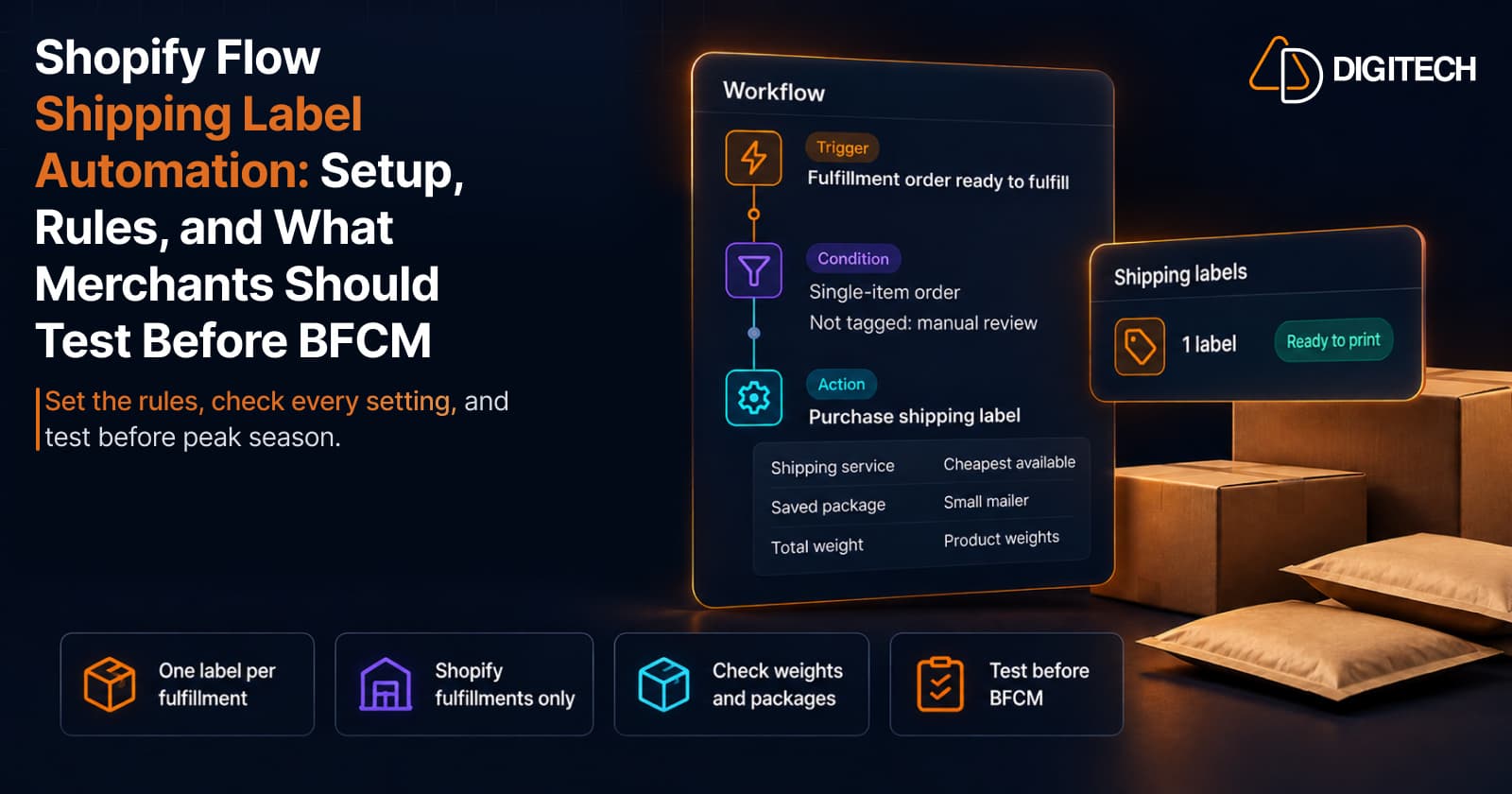
Shopify Flow Shipping Label Automation: Setup, Rules, and What Merchants Should Test Before BFCM
Shopify Flow can now buy shipping labels automatically for orders that match your rules. Here's how the action works, example workflows, and what to test before BFCM.
Read article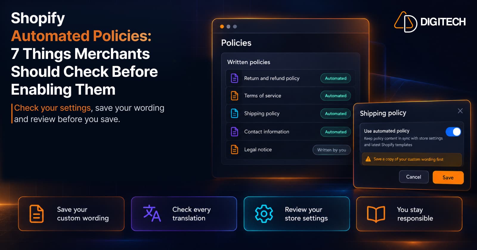
Shopify Automated Policies: 7 Things Merchants Should Check Before Enabling Them
Shopify can now generate and update your return, shipping, terms of service and contact policies from your store settings. Here's what to check before you turn automation on.
Read article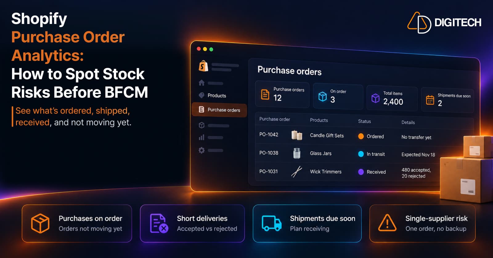
Shopify Purchase Order Analytics: How to Spot Stock Risks Before BFCM
Shopify Analytics now includes purchase order reports. Here's what each report shows, how to use them to spot stock risks before BFCM, and what they can't tell you.
Read article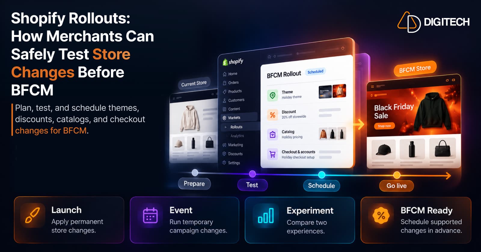
Shopify Rollouts: How Merchants Can Safely Test Store Changes Before BFCM
Learn how Shopify Rollouts let merchants schedule, test, and launch store changes safely before BFCM, including themes, discounts, catalogs, and checkout.
Read article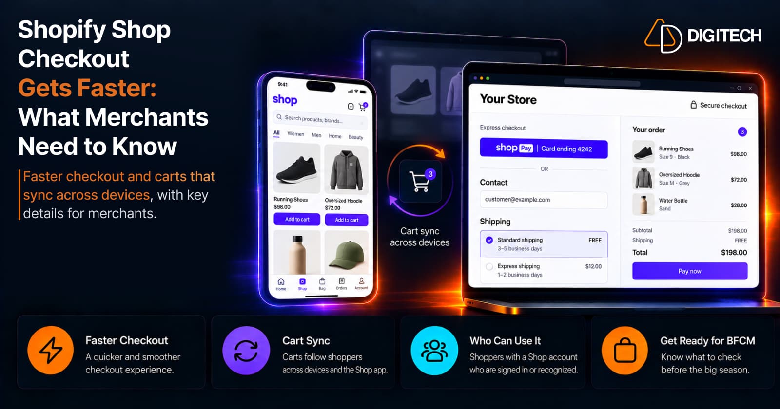
Shopify Shop Checkout Gets Faster: What Merchants Need to Know
Shopify's October 5, 2026 Shop update brings faster checkout and carts that sync across devices. See how it works, who qualifies and what to check before BFCM.
Read article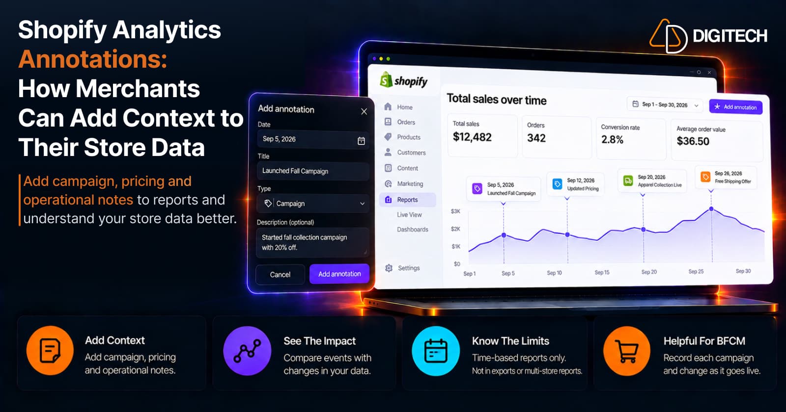
Shopify Analytics Annotations: How Merchants Can Add Context to Their Store Data
Shopify Analytics annotations let merchants add campaign, pricing and operational notes to reports. See how they work, the limits, and how to use them for BFCM.
Read article
Shopify Canvas Explained: How AI Is Changing Shopify Store Design in 2026
Shopify Canvas, announced October 1, 2026, lets merchants design a store with Sidekick. See how it works, its current limits, and what it means for developers.
Read article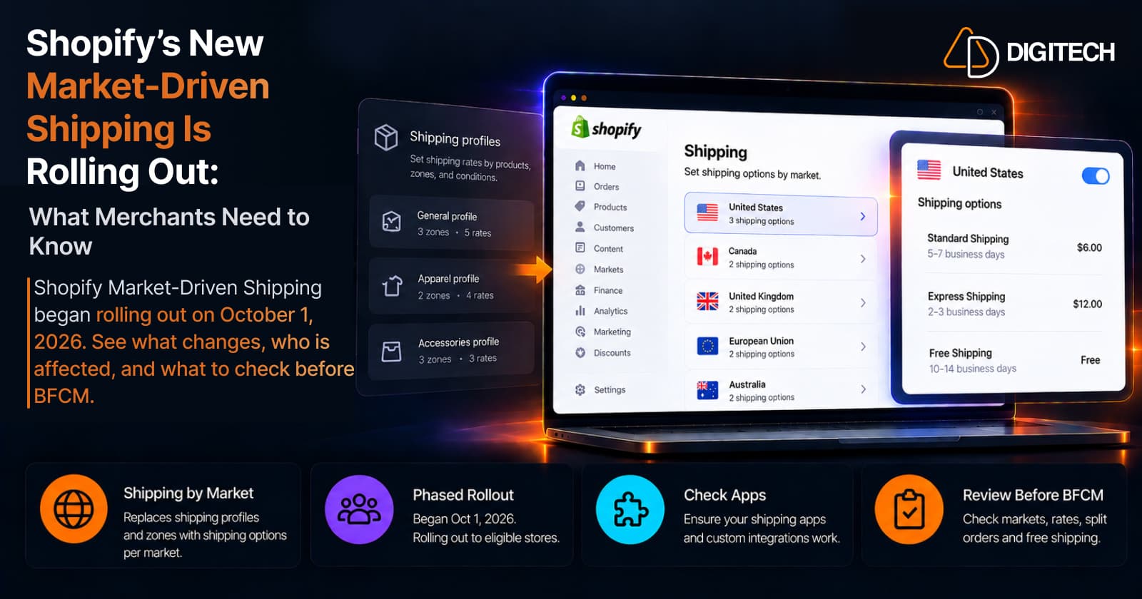
Shopify's New Market-Driven Shipping Is Rolling Out: What Merchants Need to Know
Shopify Market-Driven Shipping began rolling out on October 1, 2026. See what changes, who is affected, and what to check before BFCM.
Read article