Shopify Product Page Optimization: The CRO Checklist
A product-page checklist gets you to table stakes — pages with all the core elements convert 2–3x better than pages missing even one. But a checklist is a hypothesis, not a strategy. Here's the full CRO checklist we actually run on Shopify product pages, in priority order, plus the honest part most listicles skip: where checklists mislead.
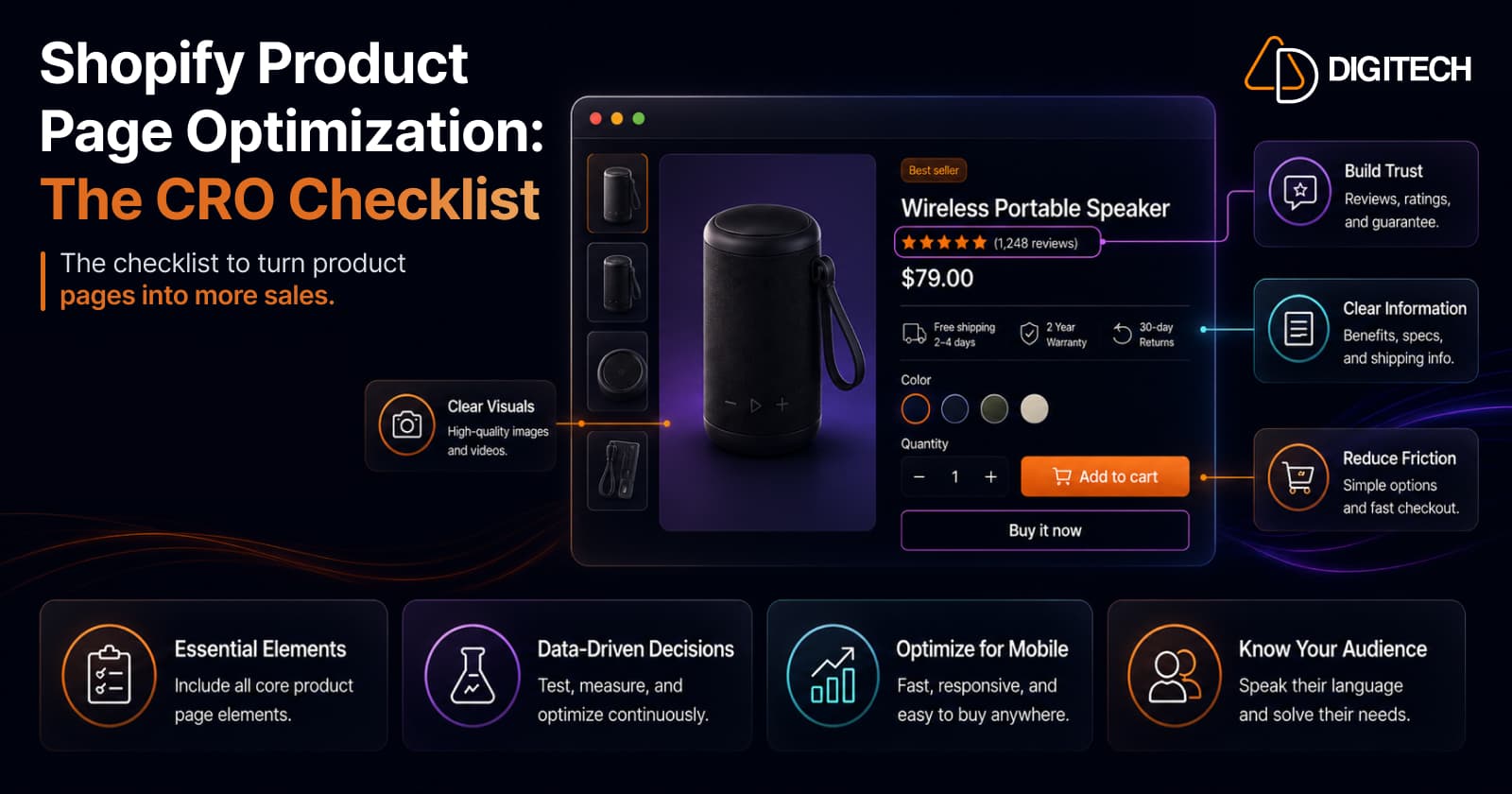
The short version: a product-page checklist gets you to table stakes — and that matters, because pages with all the core elements convert 2–3x better than pages missing even one. But a checklist is a hypothesis, not a strategy. Ship the hygiene below, then test the specifics on your own traffic. Here's the full checklist, in priority order, plus the honest part most listicles skip.
We build and optimise Shopify product pages, so this is the checklist we actually run — and the caveats we attach to it.
Before the checklist: two ground rules
1. Speed is the floor. A product page that's still loading converts nothing, no matter how good the elements are. If your mobile Largest Contentful Paint is slow, fix that first — it's the highest-leverage thing on the page and it makes every other optimisation below actually count. (See improving Core Web Vitals without ripping out your theme.) A slow store is one of the most common reasons stores leak sales despite growing traffic.
2. A checklist is a starting hypothesis, not proof. Everything here is usually true, which is why it's a sensible default. But "usually true" isn't "true for your audience, your price point, your category." Ship the checklist as hygiene, then test the specifics with real A/B testing — don't assume.
With that framing, here's the checklist.
1. Get the above-the-fold hierarchy right (highest leverage)
Most of the conversion decision happens before the shopper scrolls. The zone above the fold has to carry the primary image, the product title, the price, the star rating, and a visible add-to-cart — all without scrolling. In order of what shoppers check:
- Primary image — large, sharp, the hero of the page.
- Product title — clear, human, not a keyword salad.
- Star rating + review count, directly below the title. This is the most-checked element after the main image. Don't bury it lower down.
- Price — unambiguous, with any discount shown clearly.
- Add-to-cart button, visible without scrolling.
If a shopper has to scroll to find out whether anyone else has bought this, you've already lost some of them.
2. Images and video — at least four, each with a job
Products with four or more images convert around 28% better, but quantity isn't the point — coverage is. Your minimum four should each answer a different question:
- Front view — the clean, catalogue shot.
- Alternate angle — so it feels three-dimensional and real.
- Close-up — material, texture, finish, the detail that reassures.
- Lifestyle / in-use — the product in context, showing scale and use.
Then add customer photos. Real UGC is trusted more than stock imagery by a wide margin (roughly 72% of shoppers trust customer photos more), so a couple of genuine customer shots near the gallery pull real weight. Video, where you have it, compounds all of this.
3. Reviews and social proof — where the decision happens
Reviews aren't a "nice to have." The large majority of shoppers hesitate to buy when no reviews are visible, and adding reviews commonly lifts conversion 10–15%. The rules:
- Rating + count above the fold, below the title (see item 1).
- Full reviews further down, ideally with photos and the ability to sort.
- Place social proof where decisions happen — the product page, and again near the cart/checkout, not just on a buried reviews tab.
The goal is that at no point does a hesitating shopper have to go looking for reassurance.
4. Copy that answers the top three questions
Nobody reads a product page like a novel — they scan it hunting for the answer to a specific worry. So write for that:
- Lead with benefits, not just specs. Specs answer "what is it"; benefits answer "why does it help me."
- Answer the top three questions this product actually gets — sizing, materials, compatibility, care, shipping, whatever they are. If your support inbox keeps asking the same thing, that belongs on the page.
- Make it scannable — short paragraphs, bullets, bolded key facts. A wall of text converts like a wall.
5. The add-to-cart button
The single most important control on the page, so treat it that way:
- Visible above the fold, high contrast, unmissable.
- Persistent as they scroll — a sticky add-to-cart bar on mobile typically lifts add-to-cart rates by around 8–12%, because the primary action never leaves the screen on a long page.
- One clear primary action. Don't dilute it with competing buttons of equal weight.
6. Trust signals — near the CTA, not scattered
Reassurance works best at the exact moment of the decision. Cluster your trust signals near the add-to-cart and payment, not orphaned in the footer:
- Shipping information — cost and timeframe, stated plainly (unexpected shipping cost is a classic abandonment trigger).
- Return / refund policy — a visible, generous-sounding return policy removes risk from the decision.
- Security and payment badges — recognisable card and payment logos near the CTA, close to where money changes hands.
7. Build it mobile-first
Most of your traffic is on a phone, so the mobile layout is the product page — the desktop version is the variant. That means thumb-reachable controls, the sticky ATC from item 5, images that load fast and pinch-zoom cleanly, and copy that scans in a narrow column. Designing on desktop and hoping it "reflows" is how the majority of your visitors get the worst version of the page.
The honest part: where checklists mislead
Here's what the listicles leave out.
Don't cargo-cult dark patterns. Fake countdown timers, invented "17 people are viewing this," and fabricated low-stock warnings can nudge conversion in a test and quietly poison trust over time. Genuine scarcity is fine; fake scarcity is a short-term trick that sophisticated shoppers now spot instantly. Never fake it.
Relevance beats the rulebook. A checklist optimum for a $12 impulse buy is wrong for a $1,200 considered purchase, which needs far more reassurance, detail, and comparison. Apply judgement, not just the list.
Then measure against a real baseline. Shopify stores average roughly 1.4–3.2% conversion; clearing 3% is genuinely good and 4–5%+ is top-tier. But those are orientation, not targets — the number that matters is your product-page conversion before versus after each change. A structured CRO program usually shows results over 3–6 months because you test one thing at a time and let each reach significance. That patience is the actual strategy; the checklist is just the starting line.
The quick checklist
Copy-ready, in priority order:
- Speed — fast mobile LCP before anything else
- Above the fold — image, title, rating+count, price, visible ATC
- Images — 4+ (front, angle, close-up, lifestyle) plus customer photos
- Reviews — rating near title, full reviews below, social proof near cart
- Copy — benefits first, top-3 questions answered, scannable
- Add-to-cart — high-contrast, sticky on mobile, one primary action
- Trust — shipping, returns, payment badges clustered near the CTA
- Mobile-first — the phone layout is the real page
- Test — treat every item as a hypothesis; validate on your traffic
The bottom line
A product-page checklist is worth running because the downside of missing a core element is real — a page with gaps converts a fraction of a complete one. But the checklist only gets you to competent. The stores that pull ahead treat it as the hygiene layer, ship it fast, and then spend their energy on the part that actually compounds: testing the specific friction on their own product pages, one hypothesis at a time.
Get the checklist right, then — once they're converting — turn attention to raising average order value with post-purchase upsells on the traffic you've already earned.
We help Shopify brands diagnose and optimise product pages that actually convert — hygiene fixes, structured A/B testing, and the measurement that proves the lift. See our Shopify store development work, or talk to us about your product pages.
Frequently asked questions
What's a good conversion rate for a Shopify product page?
Shopify stores average roughly 1.4–3.2%. Clearing 3% puts you among the better-converting stores, and top performers reach 4–5% or higher. But your own baseline matters more than any global benchmark — measure your product-page conversion before and after each change rather than chasing an industry average that says nothing about your traffic, price point, or category.
What are the most important elements of a high-converting product page?
Five carry most of the weight: high-quality images (at least four), benefit-focused copy that answers your top three customer questions, a visible and persistent add-to-cart button, star-rating social proof near the title, and trust signals near the CTA. Pages with all five have been shown to convert 2–3x better than pages missing even one — which is why the checklist is worth running before you test anything fancy.
How many product images should I have?
At least four, and each should do a different job: a clean front view, an alternate angle, a close-up of the detail or material, and a lifestyle/in-use shot. Products with four or more images convert around 28% better, and real customer photos are trusted more than stock by a wide margin — so a UGC shot or two near the gallery earns its place.
Do product reviews really increase conversions?
Yes, materially. Adding reviews commonly lifts conversion by 10–15%, and the large majority of shoppers hesitate to buy when no reviews are visible at all. Put the star rating and review count directly below the product title, above the fold — it's one of the first things a shopper checks after the main image.
Does a sticky add-to-cart button help on mobile?
Generally yes. A persistent add-to-cart bar keeps the primary action reachable as shoppers scroll a long mobile page, and it typically lifts mobile add-to-cart rates by around 8–12%. Since most store traffic is mobile, it's one of the higher-return single changes you can make — though, like everything here, worth confirming on your own traffic.
Should I use countdown timers and low-stock urgency?
Carefully. Genuine scarcity — a real low-stock count, a real deadline — can help. Fabricated urgency erodes trust the moment a shopper sees through it, and can cost you more than it earns. Treat any urgency tactic as a hypothesis to A/B test, not a guaranteed win, and never fake it.
How long does product-page CRO take to show results?
A structured CRO program typically shows meaningful results within 3–6 months, because you're testing changes one at a time and letting each reach significance. The checklist items below can be shipped immediately as baseline hygiene; the compounding gains come from the testing cycle that follows, not from a single redesign.
Building something on Shopify?
We design, build, and maintain Shopify apps, stores, and AI products — to the standard this article describes.
Related reading
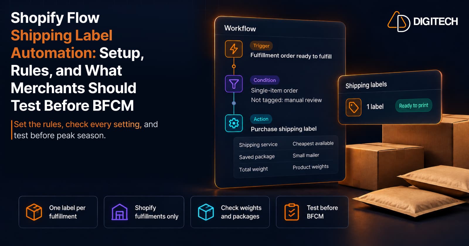
Shopify Flow Shipping Label Automation: Setup, Rules, and What Merchants Should Test Before BFCM
Shopify Flow can now buy shipping labels automatically for orders that match your rules. Here's how the action works, example workflows, and what to test before BFCM.
Read article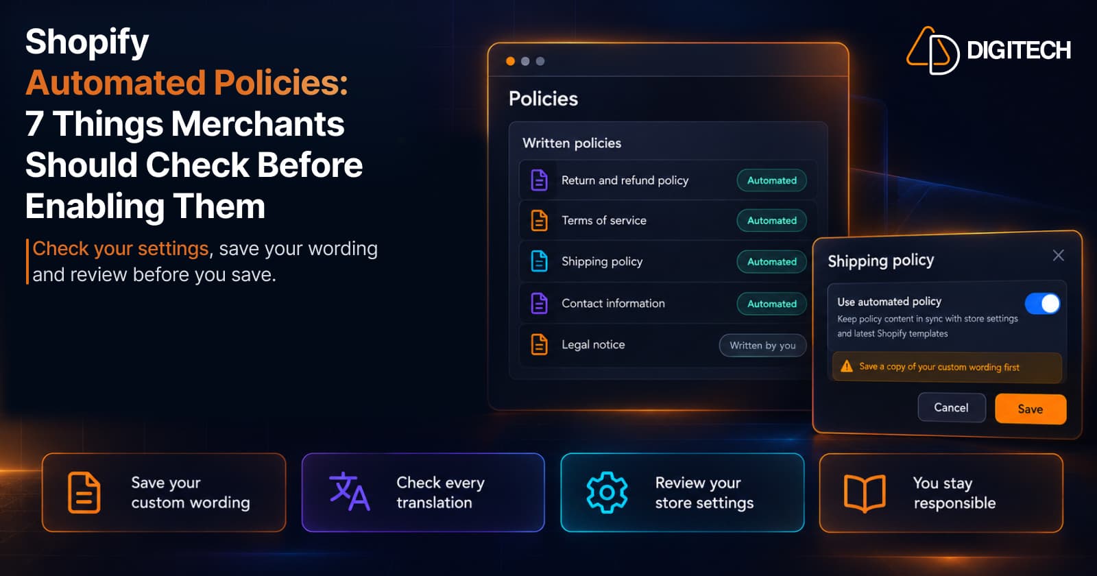
Shopify Automated Policies: 7 Things Merchants Should Check Before Enabling Them
Shopify can now generate and update your return, shipping, terms of service and contact policies from your store settings. Here's what to check before you turn automation on.
Read article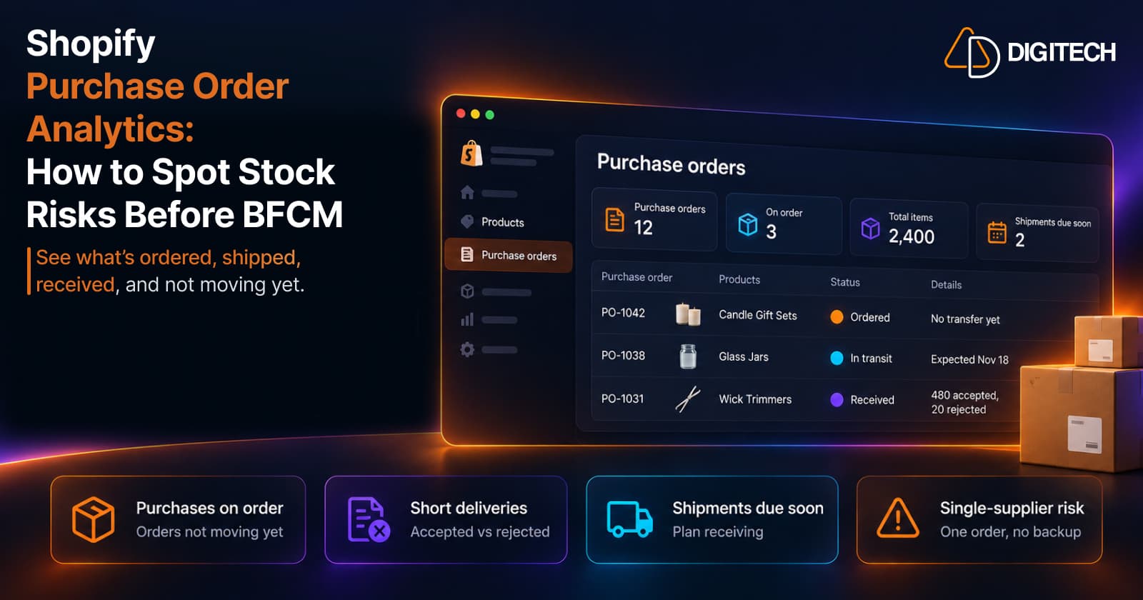
Shopify Purchase Order Analytics: How to Spot Stock Risks Before BFCM
Shopify Analytics now includes purchase order reports. Here's what each report shows, how to use them to spot stock risks before BFCM, and what they can't tell you.
Read article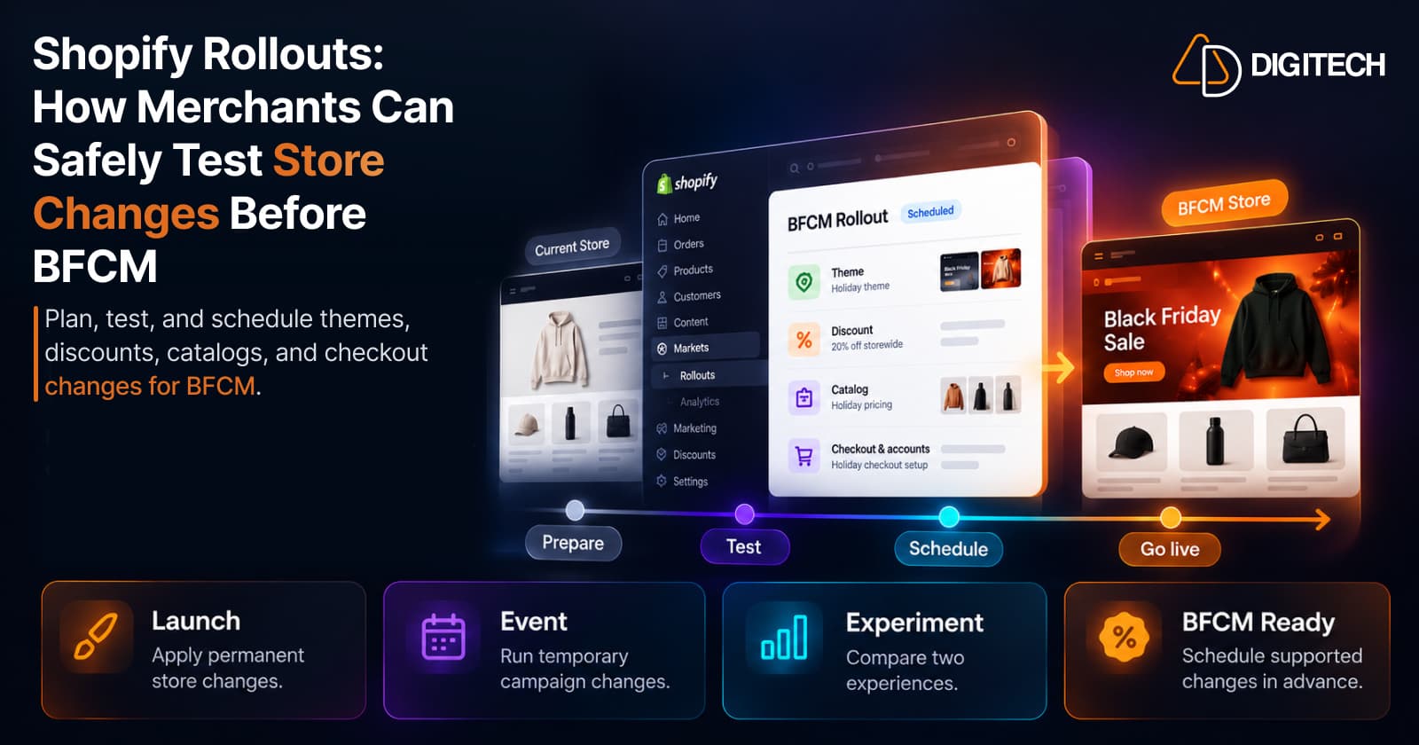
Shopify Rollouts: How Merchants Can Safely Test Store Changes Before BFCM
Learn how Shopify Rollouts let merchants schedule, test, and launch store changes safely before BFCM, including themes, discounts, catalogs, and checkout.
Read article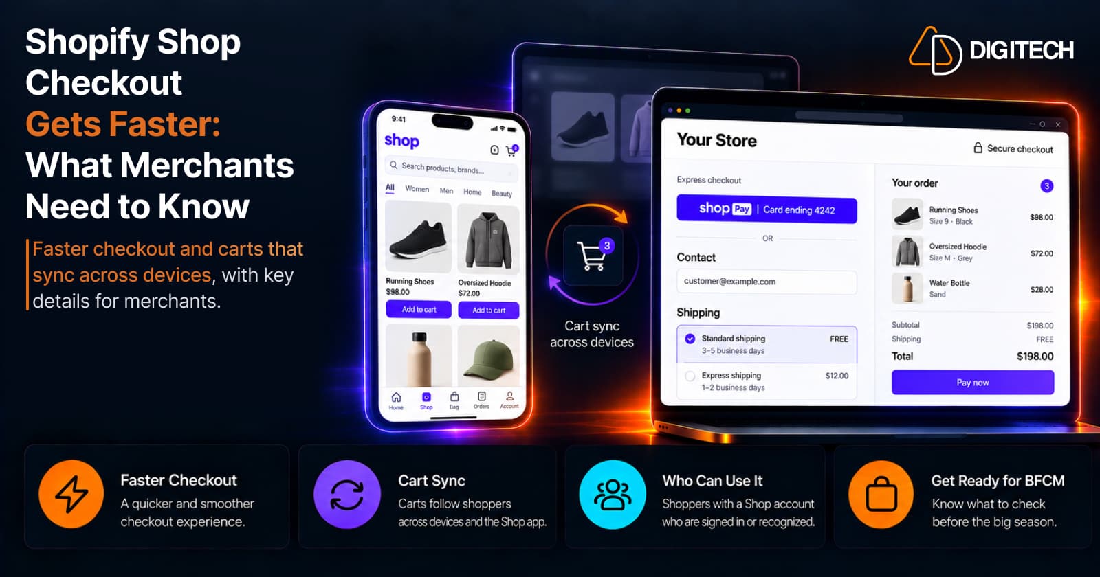
Shopify Shop Checkout Gets Faster: What Merchants Need to Know
Shopify's October 5, 2026 Shop update brings faster checkout and carts that sync across devices. See how it works, who qualifies and what to check before BFCM.
Read article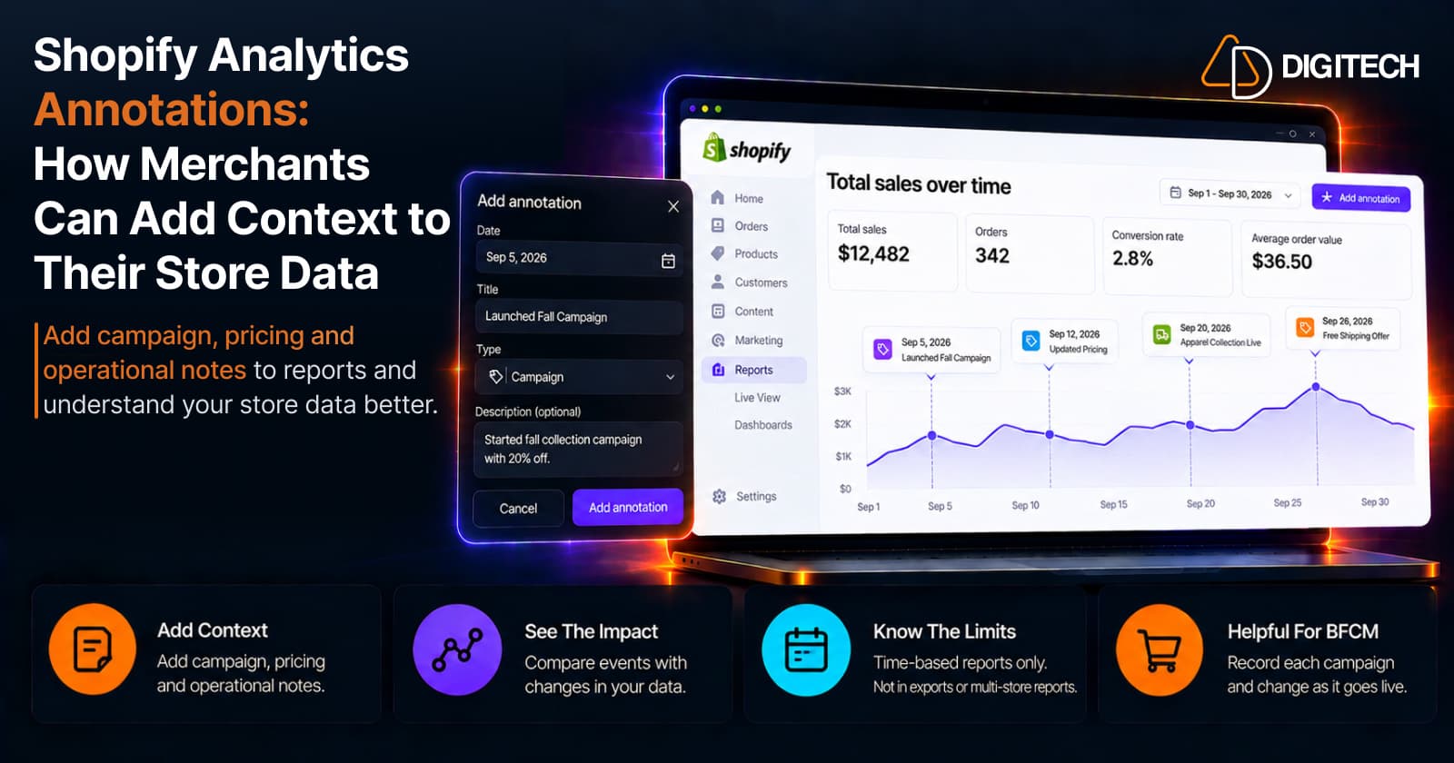
Shopify Analytics Annotations: How Merchants Can Add Context to Their Store Data
Shopify Analytics annotations let merchants add campaign, pricing and operational notes to reports. See how they work, the limits, and how to use them for BFCM.
Read article
Shopify Canvas Explained: How AI Is Changing Shopify Store Design in 2026
Shopify Canvas, announced October 1, 2026, lets merchants design a store with Sidekick. See how it works, its current limits, and what it means for developers.
Read article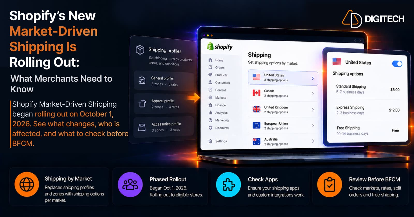
Shopify's New Market-Driven Shipping Is Rolling Out: What Merchants Need to Know
Shopify Market-Driven Shipping began rolling out on October 1, 2026. See what changes, who is affected, and what to check before BFCM.
Read article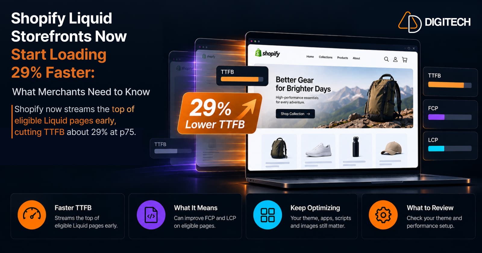
Shopify Liquid Storefronts Now Start Loading 29% Faster: What Merchants Need to Know
Shopify now streams the top of eligible Liquid pages early, cutting TTFB about 29% at p75. What it means for FCP, LCP, your theme, and what still needs fixing.
Read article